

What you’ll accomplish
You will create a Design, understand the Canvas workspace, add and configure elements, manage layers, preview the result, and save the draft.Prerequisites
- Content creation permission in the workspace.
- Media uploaded to Library if the Design will use images, video, audio, or Lottie animation.
Create a Design
- Open Studio.
- Select Create Design or Start from Blank Canvas.
- Enter a recognizable Design name.
- Choose Landscape or Portrait.
- Select the required resolution.
- Select Create Design.
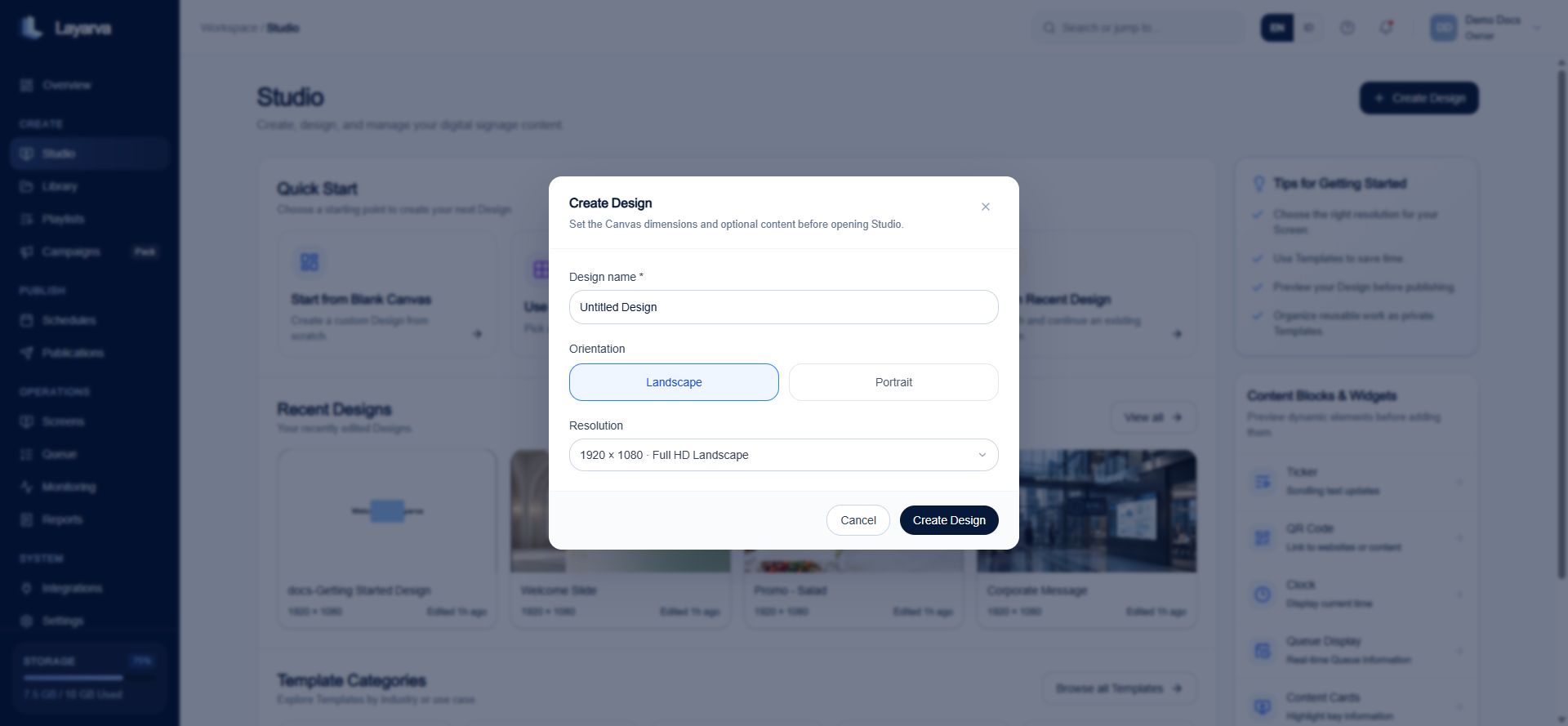
Set the name, orientation, and Canvas resolution before opening Studio.
Canvas anatomy
The editor has four working areas: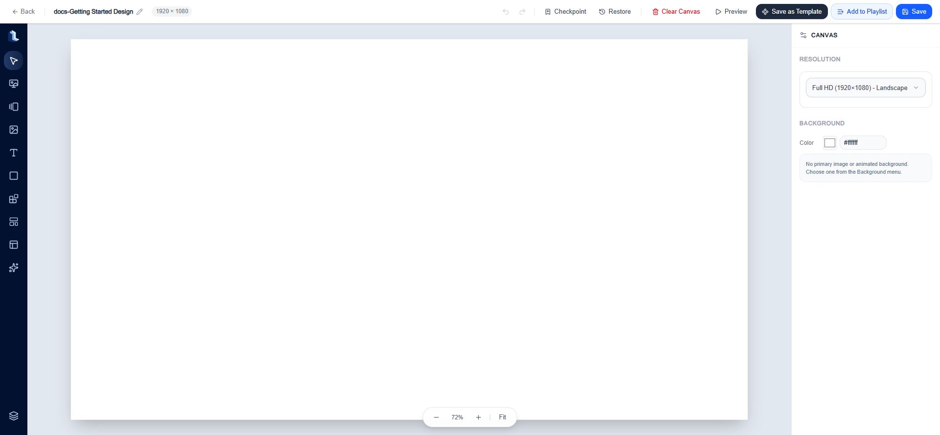
A blank Full HD landscape Canvas with the creation toolbar, stage, action bar, and Canvas inspector.
Top action bar
Protect work with Checkpoints
A Checkpoint is a named, complete snapshot of the current Design draft. It preserves the Canvas document—including its background, layers, object properties, motion, and Queue binding—without publishing the Design or creating a Playlist version. Create one before clearing the Canvas, applying a Template, reorganizing many layers, or making a change that may be difficult to reverse after the editor session ends.Create a manual Checkpoint
- Open the Design in Studio Canvas.
- Select Checkpoint in the top action bar, or press
Ctrl/Cmd+D. - Enter a description that explains the state being preserved, such as
Before changing the lobby layout. - Select Save Checkpoint.
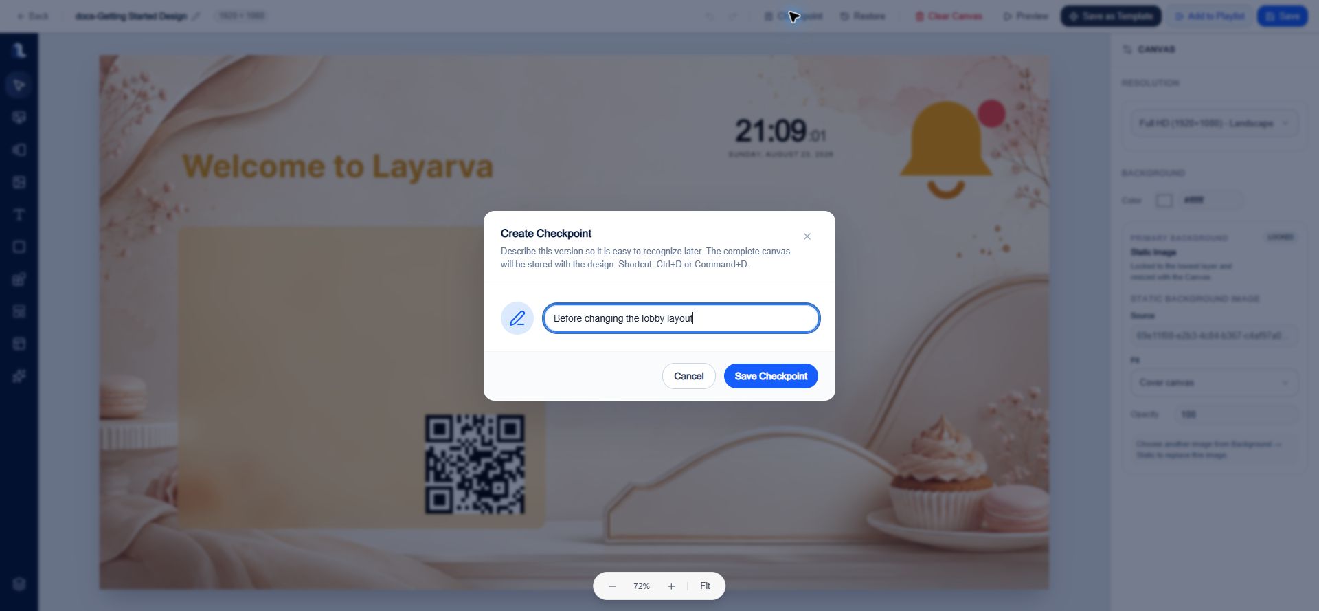
Give each recovery point a description that explains when it should be restored.
Restore a Checkpoint safely
- Select Restore in the top action bar.
- Open Manual Checkpoints or Auto Checkpoints.
- Find the required snapshot by description, date, and creator.
- Select Restore beside it.
- Choose one of these restore strategies:
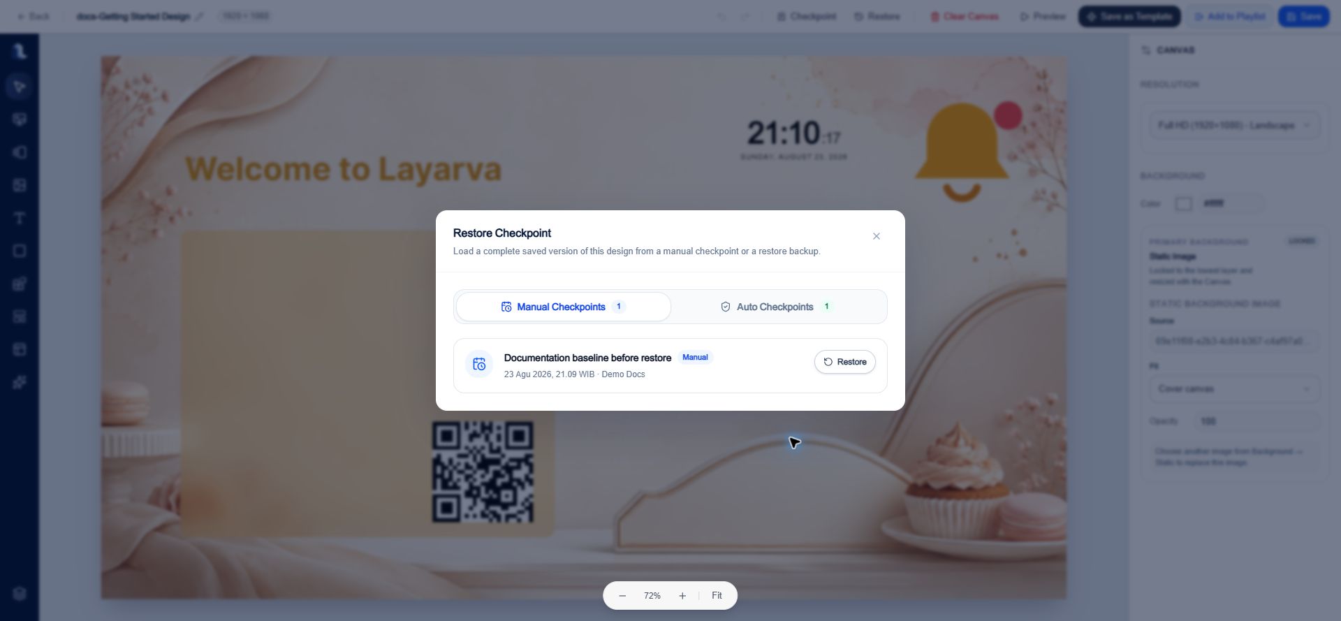
Manual and automatic recovery points are kept in separate tabs in the Restore Checkpoint history.
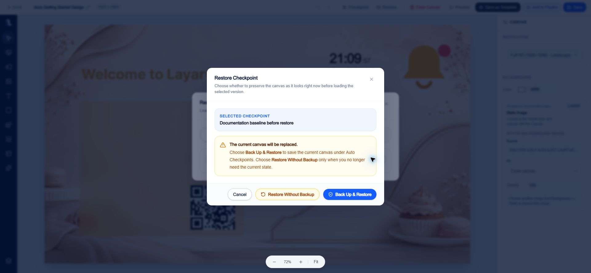
Back Up & Restore preserves the current Canvas automatically before the selected checkpoint replaces it.
Manual Checkpoints versus Auto Checkpoints
- Manual Checkpoints are created explicitly from the top action bar and use the description entered by the editor.
- Auto Checkpoints are created only when Back Up & Restore is selected. Their description identifies the snapshot as an automatic backup made before a restore.
- Undo and redo are session editing tools. Checkpoints are durable recovery points that remain available after the editor is closed.
Left creation toolbar
Most items are added by double-clicking their tile. You can then select the object on the stage and use the right inspector.Select
Use Select to return to normal selection mode. Select an object to expose its inspector, resize handles, and rotation handle. Select Deselect in the action bar to return the inspector to Canvas settings.Background
- Choose a Static or Animated background.
- Upload a background or select managed media.
- Search and filter media by group and tags.
- Set the Canvas background color in the right inspector.
Frame / Rotator
Frame / Rotator creates a mini playlist inside one Design. After adding it, select the Frame on the Canvas and use its properties to edit scenes and their sequence.Media
The Media panel supports Images, Videos, Audio, and Lottie assets. You can upload compatible media, search Library, and filter by group or tags.Text
Add a Headline, Subtitle, or Body Text preset. Text properties include:- Content and layer name.
- X and Y position, width, height, rotation, opacity, and visibility.
- Font family, weight, size, color, and left, center, or right alignment.
- Entry, update, and exit motion.
- Lock and delete actions.
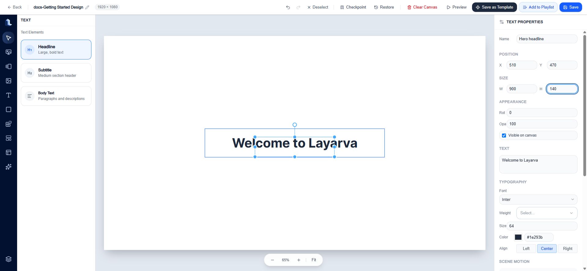
A selected Headline exposes layout, appearance, typography, motion, and element actions in the inspector.
Shapes
Add a Rectangle, Rounded Rectangle, Ellipse, or Line. Shape-specific properties include type, fill color, stroke color, style, and corner radius where applicable.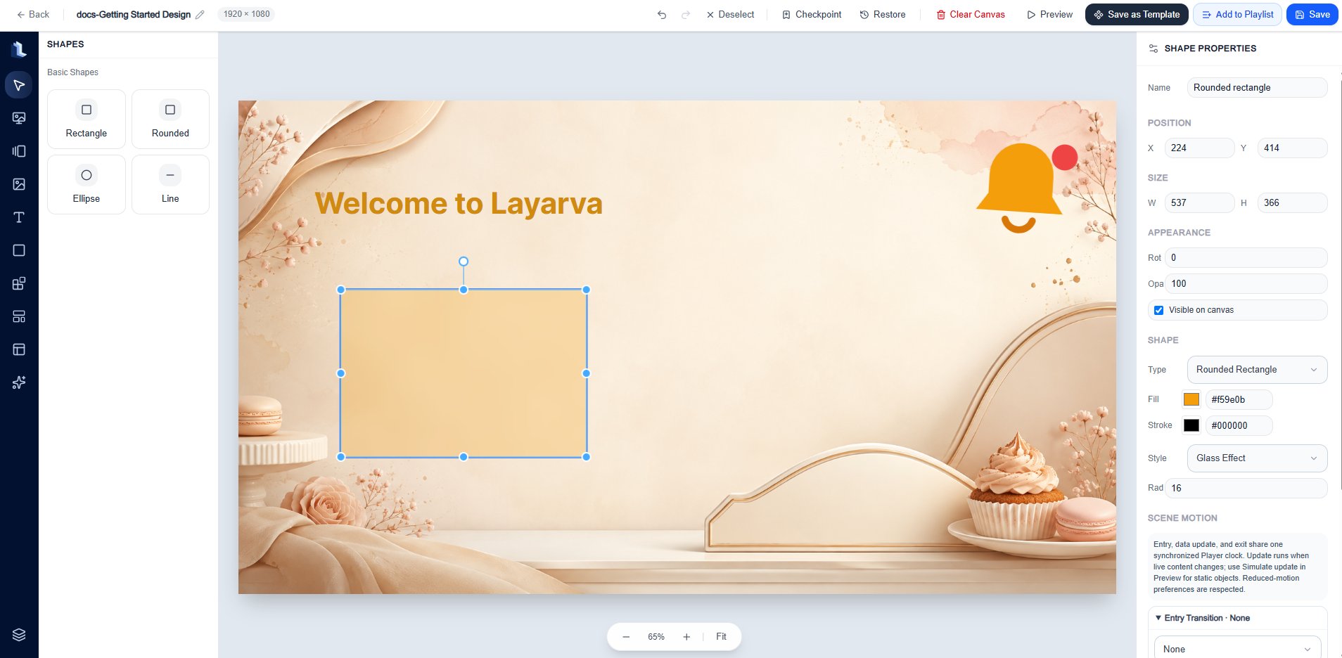
Shape properties combine the common layout controls with fill, stroke, style, and radius settings.
Built-in Widgets
The built-in Widget catalog currently includes:- Core: Countdown, Live Clock, QR Code, and Ticker.
- Information & Data: Announcements, Events, Today’s Schedule, Departure Board, Currency Rates, Summary Cards, and Charts.
- Operations: Queue Display.
- Integrations: YouTube Live, Restricted Web Embed, and Weather Forecast.
- Religious: Prayer Times.
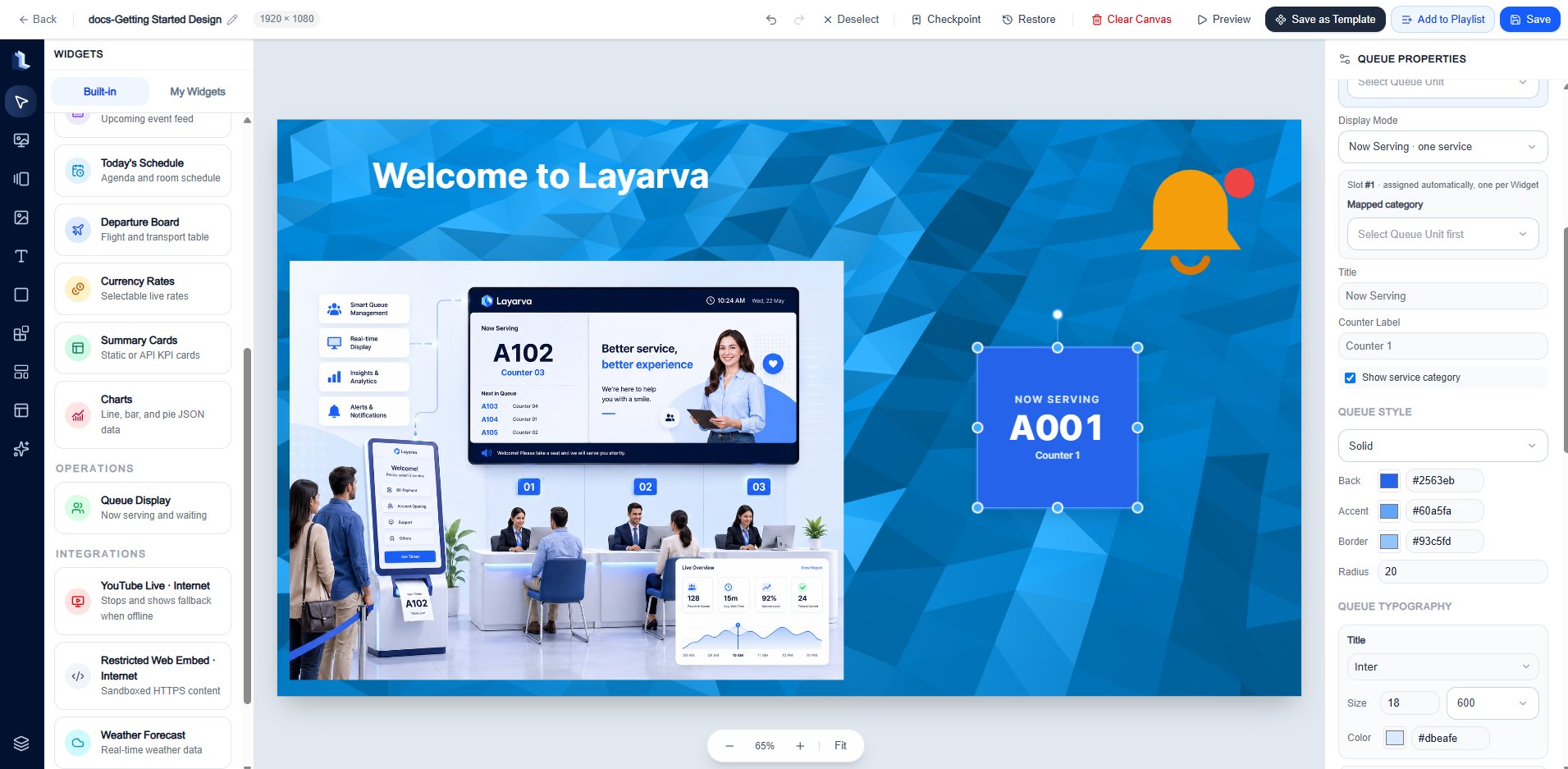
Use the Built-in tab to select supported dynamic components for a Design.
Templates
- Public Templates are maintained starting points available to the workspace.
- Private Templates are reusable compositions saved by your team.
- Applying a Template replaces or populates the current composition; review the result before saving.
Content Cards
Content Cards add prebuilt information layouts. Available families include hero, image-and-text, information, announcement, promotion, product and price, QR call-to-action, schedule and event, metrics, wayfinding, and safety notice layouts.Elements
Add searchable Icons or Emojis for visual cues. Double-click an item to add it, then use the inspector to configure its size, color, position, and motion.Layers
Layers control stacking and organization:- Select individual layers with their checkboxes.
- Group or Ungroup selected layers.
- Duplicate or Delete selected layers.
- Hide, lock, delete, move up, or move down an individual layer.
- Drag a group header to change its layer order.
- Copy and paste supported layers between Designs with
Ctrl/Cmd+CandCtrl/Cmd+V.
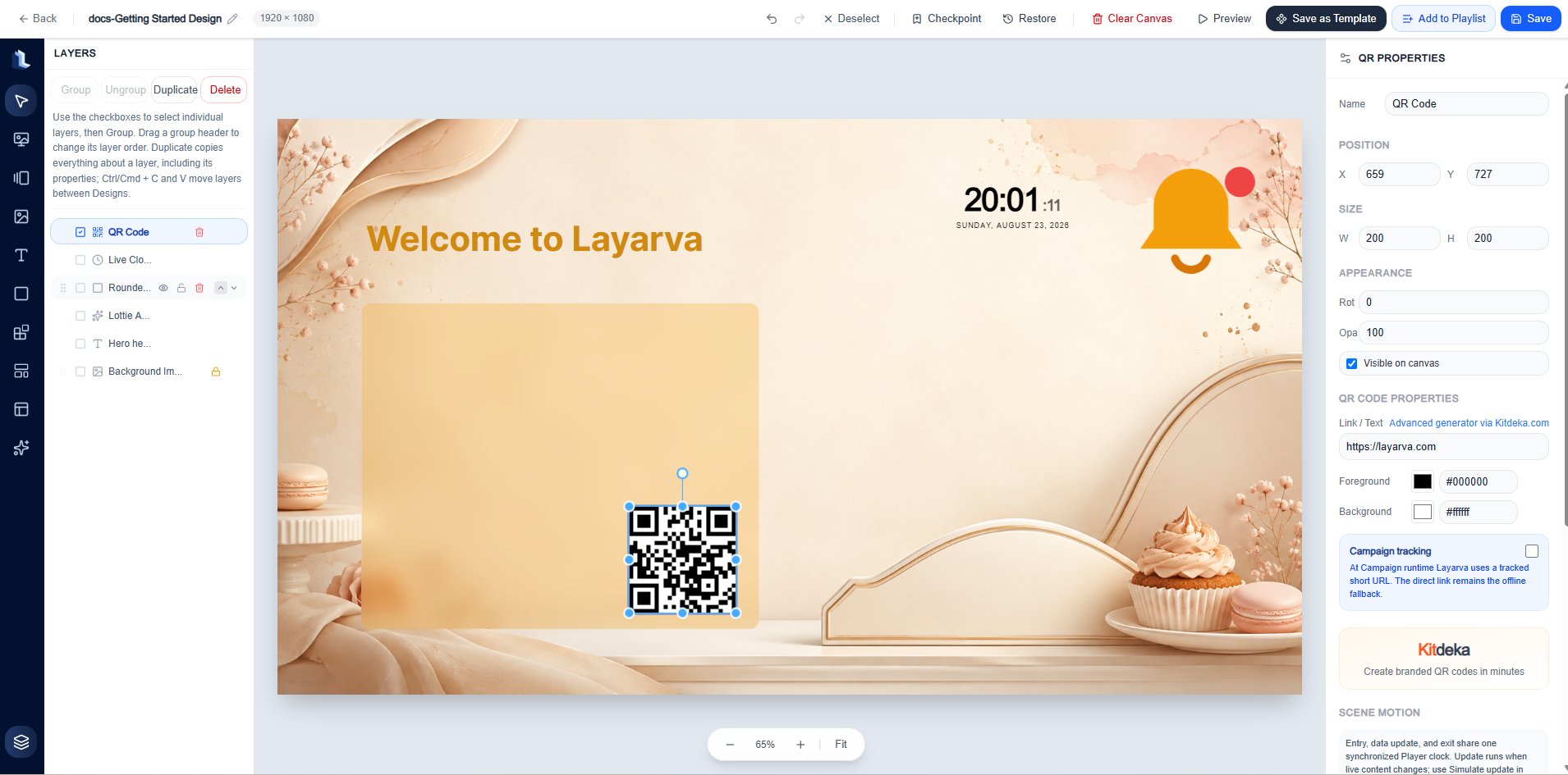
The Layers panel lists the Canvas stack and provides visibility, locking, grouping, duplication, deletion, and ordering controls.
Right inspector
When no object is selected, the inspector shows Canvas resolution, background color, and the current primary background state. When an object is selected, common properties include:Recommended editing workflow
- Set the correct resolution before composing content.
- Add a background or background color.
- Add media, text, Shapes, supported built-in Widgets, Content Cards, and Elements.
- Use the inspector for exact placement and appearance.
- Use Layers to set the stacking order and lock finished objects.
- Create a Checkpoint before a major structural change.
- Select Preview and verify motion, content fit, and dynamic fallbacks.
- Select Save.
- Select Add to Playlist when the Design is ready for sequencing.
Expected result
The saved Design is available in Library → Studio and can be added to a Playlist. The Design draft remains mutable; Playlist versions and Publications provide immutable delivery boundaries.Troubleshooting
- If content appears cropped on the target Screen, compare the Design resolution, Screen resolution, and Screen content-fit setting.
- If an object cannot be moved, unlock it in the inspector or Layers panel.
- If an object is missing, confirm that the layer is visible and above any opaque layer.
- If dynamic content is blank, verify its data source and whether the Widget requires internet access.
- If a motion does not run, verify the entry, update, or exit preset and test it in Preview.