> ## Documentation Index
> Fetch the complete documentation index at: https://docs.layarva.com/llms.txt
> Use this file to discover all available pages before exploring further.
# Create and Edit a Design
> Create a Design and use every major area of the Studio Canvas editor.
## What you'll accomplish
You will create a Design, understand the Canvas workspace, add and configure elements, manage layers, preview the result, and save the draft.
## Prerequisites
* Content creation permission in the workspace.
* Media uploaded to Library if the Design will use images, video, audio, or Lottie animation.
## Create a Design
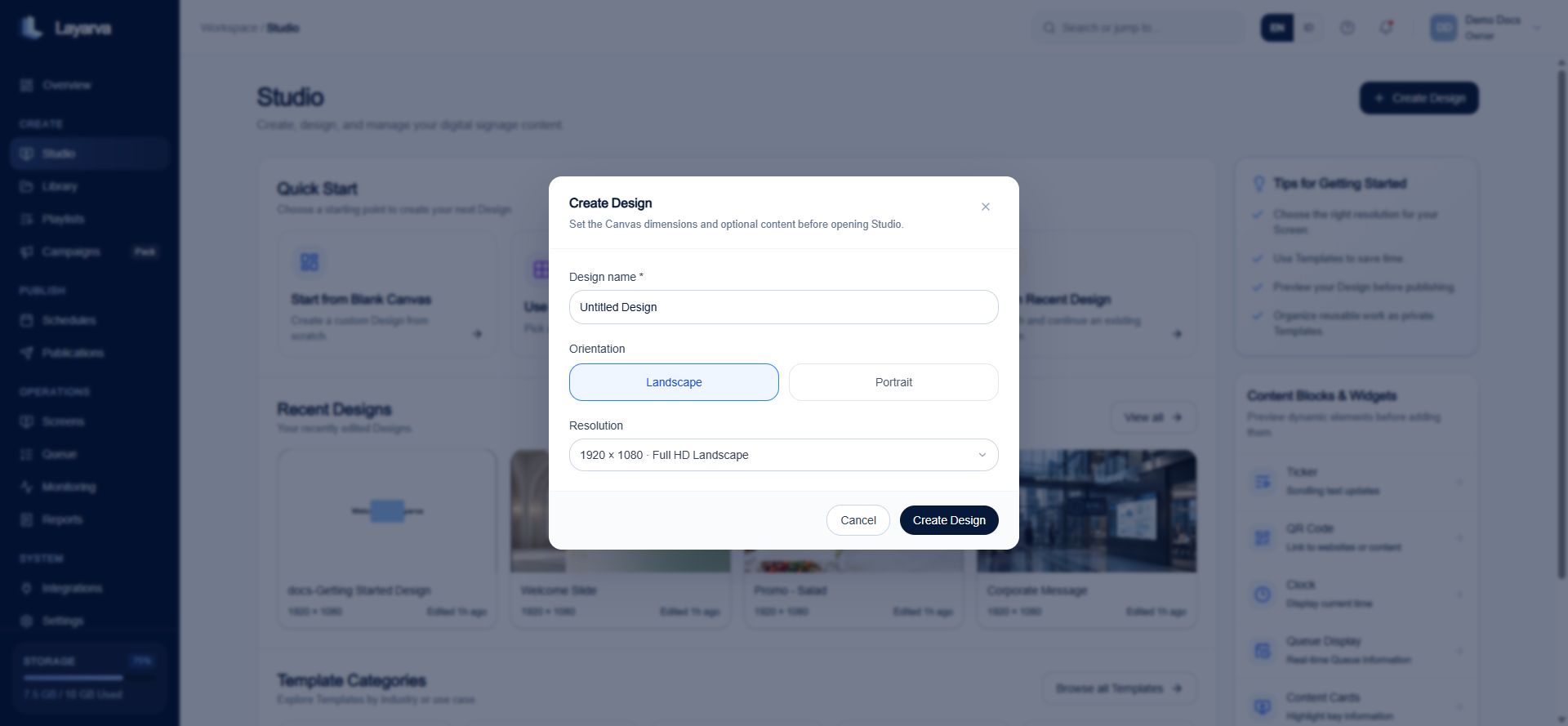
1. Open **Studio**.
2. Select **Create Design** or **Start from Blank Canvas**.
3. Enter a recognizable Design name.
4. Choose **Landscape** or **Portrait**.
5. Select the required resolution.
6. Select **Create Design**.
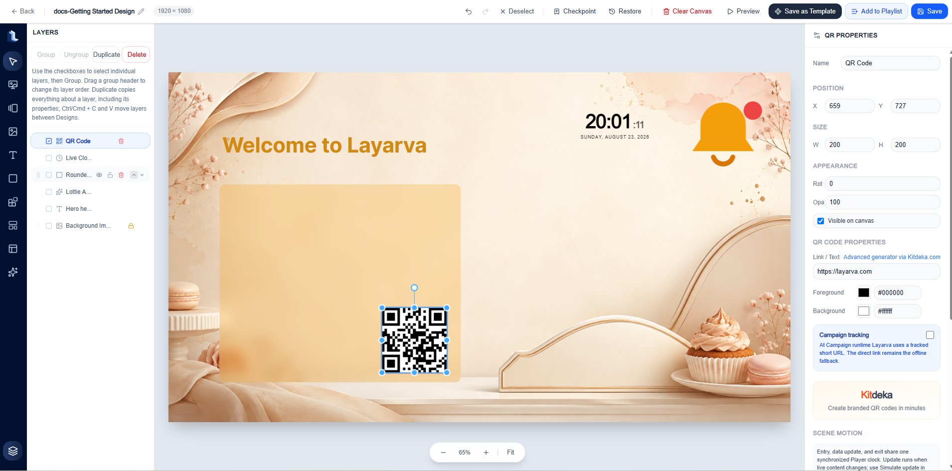
 ## Canvas anatomy
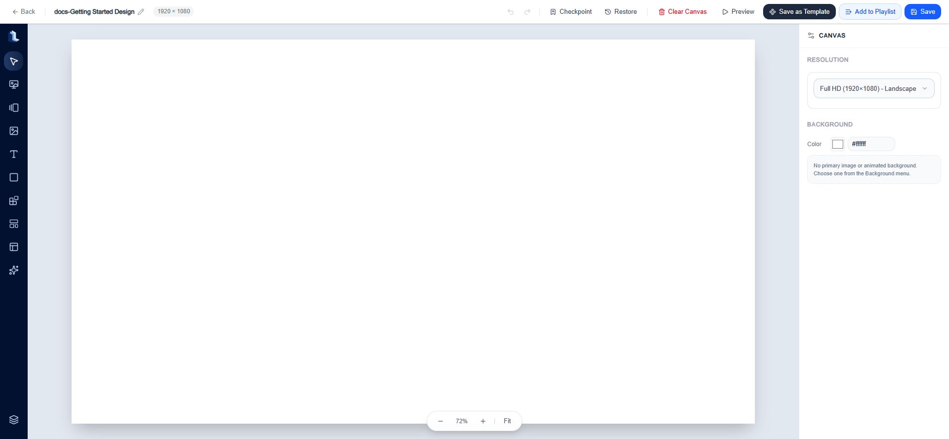
The editor has four working areas:
| Area | Purpose |
| --------------------- | ---------------------------------------------------------------------------------------------------------------------------------- |
| Top action bar | Rename the Design, undo or redo, create and restore checkpoints, clear, preview, save as a Template, add to a Playlist, and save. |
| Left creation toolbar | Open the Background, Frame / Rotator, Media, Text, Shape, built-in Widgets, Templates, Content Cards, Elements, and Layers panels. |
| Canvas stage | Position, resize, rotate, and select the objects that make up the Design. |
| Right inspector | Configure the Canvas when nothing is selected, or edit the selected object's properties. |
The zoom controls below the stage let you zoom out, zoom in, or select **Fit** to fit the complete Design in the available workspace.
## Canvas anatomy
The editor has four working areas:
| Area | Purpose |
| --------------------- | ---------------------------------------------------------------------------------------------------------------------------------- |
| Top action bar | Rename the Design, undo or redo, create and restore checkpoints, clear, preview, save as a Template, add to a Playlist, and save. |
| Left creation toolbar | Open the Background, Frame / Rotator, Media, Text, Shape, built-in Widgets, Templates, Content Cards, Elements, and Layers panels. |
| Canvas stage | Position, resize, rotate, and select the objects that make up the Design. |
| Right inspector | Configure the Canvas when nothing is selected, or edit the selected object's properties. |
The zoom controls below the stage let you zoom out, zoom in, or select **Fit** to fit the complete Design in the available workspace.
 ## Top action bar
| Control | What it does |
| ---------------- | -------------------------------------------------------------------------------- |
| Design name | Opens the rename-and-save flow. The current resolution is shown beside the name. |
| Undo / Redo | Reverses or reapplies supported Canvas edits. |
| Checkpoint | Creates a recovery point for the current draft. It does not publish the Design. |
| Restore | Restores a saved checkpoint. |
| Clear Canvas | Removes Canvas content after confirmation. |
| Preview | Opens a playback preview without creating a Playlist or Publication. |
| Save as Template | Stores the composition as a reusable private Template. |
| Add to Playlist | Saves the Design and adds it to an existing or new Playlist. |
| Save | Opens the save flow for the Design name, group, and tags. |
## Protect work with Checkpoints
A **Checkpoint** is a named, complete snapshot of the current Design draft. It preserves the Canvas document—including its background, layers, object properties, motion, and Queue binding—without publishing the Design or creating a Playlist version.
Create one before clearing the Canvas, applying a Template, reorganizing many layers, or making a change that may be difficult to reverse after the editor session ends.
### Create a manual Checkpoint
1. Open the Design in Studio Canvas.
2. Select **Checkpoint** in the top action bar, or press `Ctrl/Cmd+D`.
3. Enter a description that explains the state being preserved, such as `Before changing the lobby layout`.
4. Select **Save Checkpoint**.
## Top action bar
| Control | What it does |
| ---------------- | -------------------------------------------------------------------------------- |
| Design name | Opens the rename-and-save flow. The current resolution is shown beside the name. |
| Undo / Redo | Reverses or reapplies supported Canvas edits. |
| Checkpoint | Creates a recovery point for the current draft. It does not publish the Design. |
| Restore | Restores a saved checkpoint. |
| Clear Canvas | Removes Canvas content after confirmation. |
| Preview | Opens a playback preview without creating a Playlist or Publication. |
| Save as Template | Stores the composition as a reusable private Template. |
| Add to Playlist | Saves the Design and adds it to an existing or new Playlist. |
| Save | Opens the save flow for the Design name, group, and tags. |
## Protect work with Checkpoints
A **Checkpoint** is a named, complete snapshot of the current Design draft. It preserves the Canvas document—including its background, layers, object properties, motion, and Queue binding—without publishing the Design or creating a Playlist version.
Create one before clearing the Canvas, applying a Template, reorganizing many layers, or making a change that may be difficult to reverse after the editor session ends.
### Create a manual Checkpoint
1. Open the Design in Studio Canvas.
2. Select **Checkpoint** in the top action bar, or press `Ctrl/Cmd+D`.
3. Enter a description that explains the state being preserved, such as `Before changing the lobby layout`.
4. Select **Save Checkpoint**.
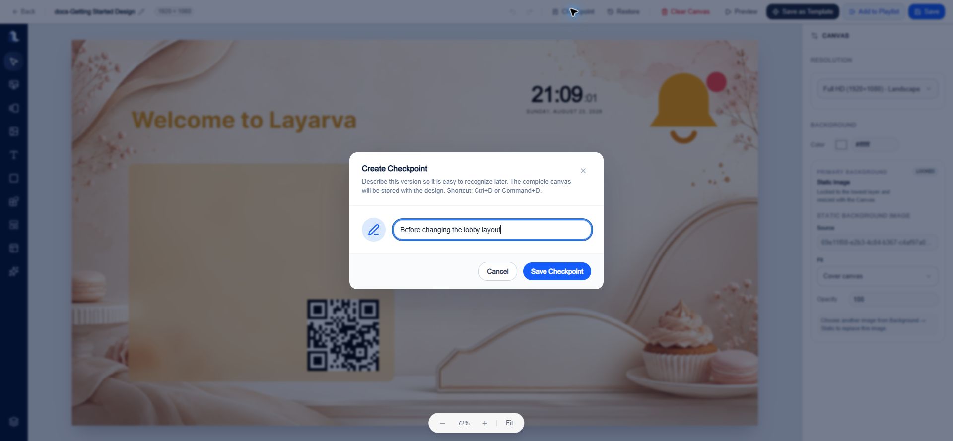 The current Canvas remains open and editable. The new snapshot appears under **Restore → Manual Checkpoints**.
### Restore a Checkpoint safely
1. Select **Restore** in the top action bar.
2. Open **Manual Checkpoints** or **Auto Checkpoints**.
3. Find the required snapshot by description, date, and creator.
4. Select **Restore** beside it.
5. Choose one of these restore strategies:
| Choice | Result | Use when |
| -------------------------- | -------------------------------------------------------------------------------------- | ------------------------------------------------------------------------------------- |
| **Back Up & Restore** | Saves the current Canvas as an automatic checkpoint, then loads the selected snapshot. | Recommended for normal recovery because the state being replaced remains recoverable. |
| **Restore Without Backup** | Immediately replaces the current Canvas with the selected snapshot. | Only when the current state is no longer needed. |
The current Canvas remains open and editable. The new snapshot appears under **Restore → Manual Checkpoints**.
### Restore a Checkpoint safely
1. Select **Restore** in the top action bar.
2. Open **Manual Checkpoints** or **Auto Checkpoints**.
3. Find the required snapshot by description, date, and creator.
4. Select **Restore** beside it.
5. Choose one of these restore strategies:
| Choice | Result | Use when |
| -------------------------- | -------------------------------------------------------------------------------------- | ------------------------------------------------------------------------------------- |
| **Back Up & Restore** | Saves the current Canvas as an automatic checkpoint, then loads the selected snapshot. | Recommended for normal recovery because the state being replaced remains recoverable. |
| **Restore Without Backup** | Immediately replaces the current Canvas with the selected snapshot. | Only when the current state is no longer needed. |
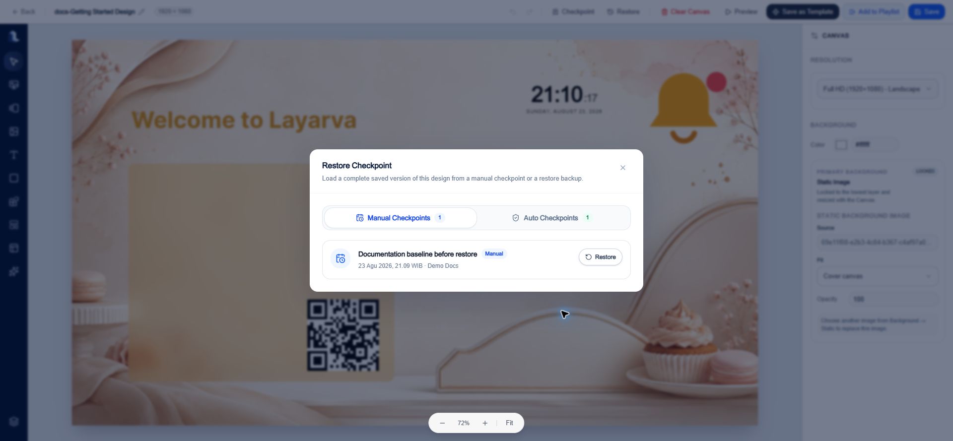
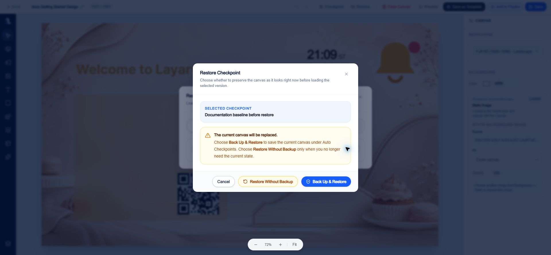 Restore replaces the complete current Canvas, not only the selected layers. Use **Back Up & Restore** unless you intentionally want to discard the current state.
### Manual Checkpoints versus Auto Checkpoints
* **Manual Checkpoints** are created explicitly from the top action bar and use the description entered by the editor.
* **Auto Checkpoints** are created only when **Back Up & Restore** is selected. Their description identifies the snapshot as an automatic backup made before a restore.
* Undo and redo are session editing tools. Checkpoints are durable recovery points that remain available after the editor is closed.
## Left creation toolbar
Most items are added by double-clicking their tile. You can then select the object on the stage and use the right inspector.
### Select
Use **Select** to return to normal selection mode. Select an object to expose its inspector, resize handles, and rotation handle. Select **Deselect** in the action bar to return the inspector to Canvas settings.
### Background
* Choose a **Static** or **Animated** background.
* Upload a background or select managed media.
* Search and filter media by group and tags.
* Set the Canvas background color in the right inspector.
### Frame / Rotator
Frame / Rotator creates a mini playlist inside one Design. After adding it, select the Frame on the Canvas and use its properties to edit scenes and their sequence.
### Media
The Media panel supports **Images**, **Videos**, **Audio**, and **Lottie** assets. You can upload compatible media, search Library, and filter by group or tags.
### Text
Add a **Headline**, **Subtitle**, or **Body Text** preset. Text properties include:
* Content and layer name.
* X and Y position, width, height, rotation, opacity, and visibility.
* Font family, weight, size, color, and left, center, or right alignment.
* Entry, update, and exit motion.
* Lock and delete actions.
Restore replaces the complete current Canvas, not only the selected layers. Use **Back Up & Restore** unless you intentionally want to discard the current state.
### Manual Checkpoints versus Auto Checkpoints
* **Manual Checkpoints** are created explicitly from the top action bar and use the description entered by the editor.
* **Auto Checkpoints** are created only when **Back Up & Restore** is selected. Their description identifies the snapshot as an automatic backup made before a restore.
* Undo and redo are session editing tools. Checkpoints are durable recovery points that remain available after the editor is closed.
## Left creation toolbar
Most items are added by double-clicking their tile. You can then select the object on the stage and use the right inspector.
### Select
Use **Select** to return to normal selection mode. Select an object to expose its inspector, resize handles, and rotation handle. Select **Deselect** in the action bar to return the inspector to Canvas settings.
### Background
* Choose a **Static** or **Animated** background.
* Upload a background or select managed media.
* Search and filter media by group and tags.
* Set the Canvas background color in the right inspector.
### Frame / Rotator
Frame / Rotator creates a mini playlist inside one Design. After adding it, select the Frame on the Canvas and use its properties to edit scenes and their sequence.
### Media
The Media panel supports **Images**, **Videos**, **Audio**, and **Lottie** assets. You can upload compatible media, search Library, and filter by group or tags.
### Text
Add a **Headline**, **Subtitle**, or **Body Text** preset. Text properties include:
* Content and layer name.
* X and Y position, width, height, rotation, opacity, and visibility.
* Font family, weight, size, color, and left, center, or right alignment.
* Entry, update, and exit motion.
* Lock and delete actions.
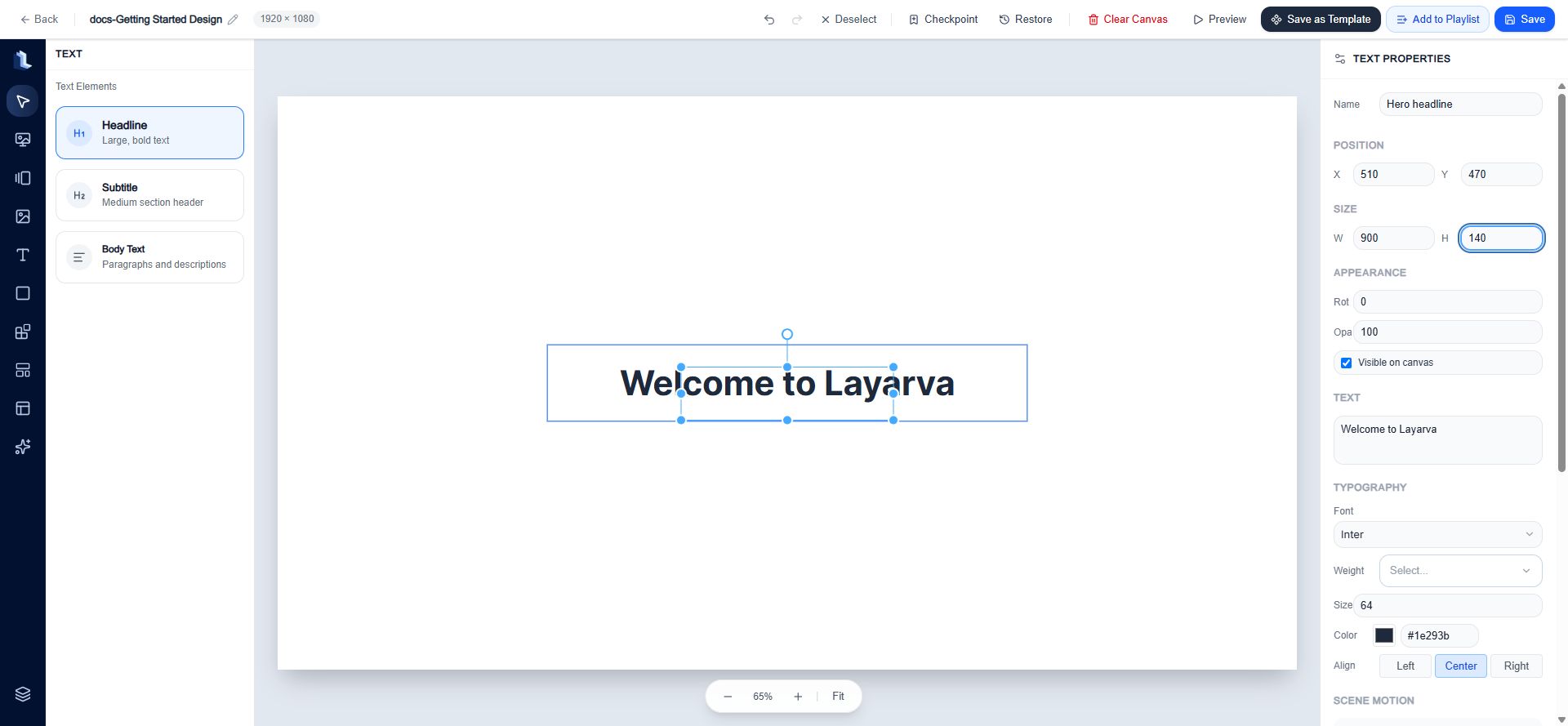 Double-click text on the stage to edit its content directly.
### Shapes
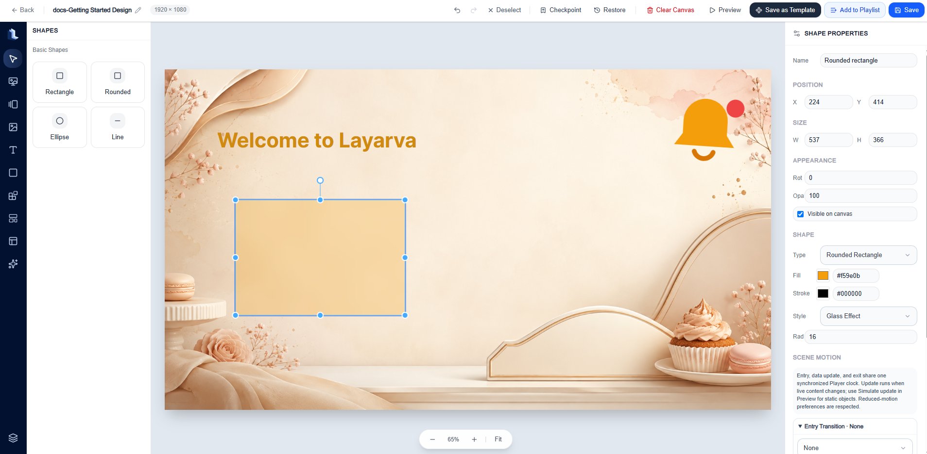
Add a **Rectangle**, **Rounded Rectangle**, **Ellipse**, or **Line**. Shape-specific properties include type, fill color, stroke color, style, and corner radius where applicable.
Double-click text on the stage to edit its content directly.
### Shapes
Add a **Rectangle**, **Rounded Rectangle**, **Ellipse**, or **Line**. Shape-specific properties include type, fill color, stroke color, style, and corner radius where applicable.
 ### Built-in Widgets
The built-in Widget catalog currently includes:
* **Core:** Countdown, Live Clock, QR Code, and Ticker.
* **Information & Data:** Announcements, Events, Today's Schedule, Departure Board, Currency Rates, Summary Cards, and Charts.
* **Operations:** Queue Display.
* **Integrations:** YouTube Live, Restricted Web Embed, and Weather Forecast.
* **Religious:** Prayer Times.
Some Widgets use static configuration, managed Layarva data, or a supported dynamic API. Internet-dependent Widgets may stop or show a fallback while the Player is offline.
### Built-in Widgets
The built-in Widget catalog currently includes:
* **Core:** Countdown, Live Clock, QR Code, and Ticker.
* **Information & Data:** Announcements, Events, Today's Schedule, Departure Board, Currency Rates, Summary Cards, and Charts.
* **Operations:** Queue Display.
* **Integrations:** YouTube Live, Restricted Web Embed, and Weather Forecast.
* **Religious:** Prayer Times.
Some Widgets use static configuration, managed Layarva data, or a supported dynamic API. Internet-dependent Widgets may stop or show a fallback while the Player is offline.
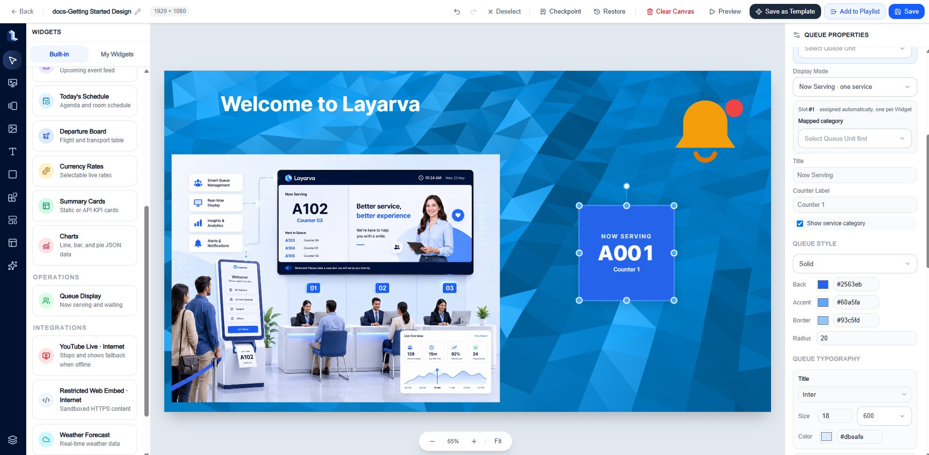 Custom Widgets and the **My Widgets** workflow are intentionally outside the scope of this documentation phase.
### Templates
* **Public** Templates are maintained starting points available to the workspace.
* **Private** Templates are reusable compositions saved by your team.
* Applying a Template replaces or populates the current composition; review the result before saving.
### Content Cards
Content Cards add prebuilt information layouts. Available families include hero, image-and-text, information, announcement, promotion, product and price, QR call-to-action, schedule and event, metrics, wayfinding, and safety notice layouts.
### Elements
Add searchable **Icons** or **Emojis** for visual cues. Double-click an item to add it, then use the inspector to configure its size, color, position, and motion.
### Layers
Layers control stacking and organization:
* Select individual layers with their checkboxes.
* **Group** or **Ungroup** selected layers.
* **Duplicate** or **Delete** selected layers.
* Hide, lock, delete, move up, or move down an individual layer.
* Drag a group header to change its layer order.
* Copy and paste supported layers between Designs with `Ctrl/Cmd+C` and `Ctrl/Cmd+V`.
Custom Widgets and the **My Widgets** workflow are intentionally outside the scope of this documentation phase.
### Templates
* **Public** Templates are maintained starting points available to the workspace.
* **Private** Templates are reusable compositions saved by your team.
* Applying a Template replaces or populates the current composition; review the result before saving.
### Content Cards
Content Cards add prebuilt information layouts. Available families include hero, image-and-text, information, announcement, promotion, product and price, QR call-to-action, schedule and event, metrics, wayfinding, and safety notice layouts.
### Elements
Add searchable **Icons** or **Emojis** for visual cues. Double-click an item to add it, then use the inspector to configure its size, color, position, and motion.
### Layers
Layers control stacking and organization:
* Select individual layers with their checkboxes.
* **Group** or **Ungroup** selected layers.
* **Duplicate** or **Delete** selected layers.
* Hide, lock, delete, move up, or move down an individual layer.
* Drag a group header to change its layer order.
* Copy and paste supported layers between Designs with `Ctrl/Cmd+C` and `Ctrl/Cmd+V`.
 ## Right inspector
When no object is selected, the inspector shows Canvas resolution, background color, and the current primary background state.
When an object is selected, common properties include:
| Section | Controls |
| ------------------------ | -------------------------------------------------------------------------------------------------------- |
| Name | Human-readable layer name. |
| Position | X and Y coordinates. |
| Size | Width and height. |
| Appearance | Rotation, opacity, and Canvas visibility. |
| Type-specific properties | Text, shape, media, Frame, Widget, Card, icon, or emoji configuration. |
| Scene Motion | Entry, live-data update, and exit transitions with duration, delay, easing, and reduced-motion behavior. |
| Actions | Lock or unlock and delete. |
Motion uses one synchronized Player clock. Update motion runs when live content changes; Preview can simulate an update for static objects. Reduced-motion preferences are respected according to the selected behavior.
## Recommended editing workflow
1. Set the correct resolution before composing content.
2. Add a background or background color.
3. Add media, text, Shapes, supported built-in Widgets, Content Cards, and Elements.
4. Use the inspector for exact placement and appearance.
5. Use Layers to set the stacking order and lock finished objects.
6. Create a **Checkpoint** before a major structural change.
7. Select **Preview** and verify motion, content fit, and dynamic fallbacks.
8. Select **Save**.
9. Select **Add to Playlist** when the Design is ready for sequencing.
## Expected result
The saved Design is available in **Library → Studio** and can be added to a Playlist. The Design draft remains mutable; Playlist versions and Publications provide immutable delivery boundaries.
## Troubleshooting
* If content appears cropped on the target Screen, compare the Design resolution, Screen resolution, and Screen content-fit setting.
* If an object cannot be moved, unlock it in the inspector or Layers panel.
* If an object is missing, confirm that the layer is visible and above any opaque layer.
* If dynamic content is blank, verify its data source and whether the Widget requires internet access.
* If a motion does not run, verify the entry, update, or exit preset and test it in Preview.
## Related guides
* [Navigate Layarva Studio](/studio/overview)
* [Create a Playlist](/studio/playlists)
* [Understand Publishing](/studio/publishing)
## Right inspector
When no object is selected, the inspector shows Canvas resolution, background color, and the current primary background state.
When an object is selected, common properties include:
| Section | Controls |
| ------------------------ | -------------------------------------------------------------------------------------------------------- |
| Name | Human-readable layer name. |
| Position | X and Y coordinates. |
| Size | Width and height. |
| Appearance | Rotation, opacity, and Canvas visibility. |
| Type-specific properties | Text, shape, media, Frame, Widget, Card, icon, or emoji configuration. |
| Scene Motion | Entry, live-data update, and exit transitions with duration, delay, easing, and reduced-motion behavior. |
| Actions | Lock or unlock and delete. |
Motion uses one synchronized Player clock. Update motion runs when live content changes; Preview can simulate an update for static objects. Reduced-motion preferences are respected according to the selected behavior.
## Recommended editing workflow
1. Set the correct resolution before composing content.
2. Add a background or background color.
3. Add media, text, Shapes, supported built-in Widgets, Content Cards, and Elements.
4. Use the inspector for exact placement and appearance.
5. Use Layers to set the stacking order and lock finished objects.
6. Create a **Checkpoint** before a major structural change.
7. Select **Preview** and verify motion, content fit, and dynamic fallbacks.
8. Select **Save**.
9. Select **Add to Playlist** when the Design is ready for sequencing.
## Expected result
The saved Design is available in **Library → Studio** and can be added to a Playlist. The Design draft remains mutable; Playlist versions and Publications provide immutable delivery boundaries.
## Troubleshooting
* If content appears cropped on the target Screen, compare the Design resolution, Screen resolution, and Screen content-fit setting.
* If an object cannot be moved, unlock it in the inspector or Layers panel.
* If an object is missing, confirm that the layer is visible and above any opaque layer.
* If dynamic content is blank, verify its data source and whether the Widget requires internet access.
* If a motion does not run, verify the entry, update, or exit preset and test it in Preview.
## Related guides
* [Navigate Layarva Studio](/studio/overview)
* [Create a Playlist](/studio/playlists)
* [Understand Publishing](/studio/publishing)